Alternatives to Alt Text
When the term “accessibility” is used, everyone seems to jump at the chance to level the playing field for their students. Surprisingly, sometimes in our attempt to assist, the alternative text (alt text) we create can actually be a distraction or a frustration. It is important to consider the intention, context and purpose of the image prior to creating the alt text. In addition, other strategies can be more effective — including not using any alt text at all.
In December of 2021, DELTA launched a new accessibility team to guide best practices. The team is composed of Instructional Technologist Jill Anderson, Associate Director of Data, Integrations and Custom Applications Jonathan Champ, Instructional Designer Caitlin McKeown and Multimedia Development Team Lead David Tredwell.
The team offers guidance on how to approach creating a valuable narrative to provide key information as needed and the thought process to use when deciding if additional information is needed. Even though the old adage suggests “a picture is worth a thousand words,” this certainly does not mean you should use a thousand words as alt text!
Definition
“Most of us have heard of and used alt text before. It’s an HTML attribute you put into the code for pictures or illustrations that screen readers look for to describe an image to users,” explains McKeown. For those of us that create it, but do not actually go back and listen to it, we are unsure how helpful it actually is to those who need it most.
Even though the alt text is an invisible attribute that is not displayed by default, for those who need this tool, it provides a description of the image so they can get the full experience intended. Think about the images or diagrams used on graded assignments. Would it be fair for a student to be evaluated on their comprehension of subject matter they cannot access? It would be like removing the same images and diagrams for the students that do not use alt text to understand the material. Simply put, it is not equitable.
Tip: There is no need to begin alt text with “This is an image of” because the screen reader automatically announces this information. Adding that to the alt text would be redundant.
Intention
To create helpful alt text it is essential to understand the intention behind including the image. In fact, many images are considered to be decorative, in which case alt text can be distracting rather than helpful in understanding the lesson. A good general rule is to consider how long a sighted person would spend studying an image. The longer they would look at it to understand the lesson, the more important it is to create effective alt text.
There is such a thing as being too descriptive, especially when the image is not very important to the context and intent of its usage. For example, what are all the ways you could describe the following image?
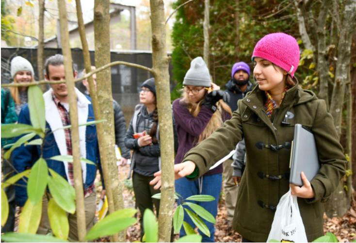
An overly descriptive version of alt text for this photograph might be “a group of seven students visits a forest on a class project. The rightmost student in the foreground wears a dark green jacket and bright pink cap while carrying a laptop and grocery bag and gesturing out of the frame. The third student from the right wears a purple sweater and gray cap, tucking a pencil behind her ear…” Using a very literal approach to make sure everything in the photo can be imagined can actually take away from the important factors.
To create effective alt text, consider the following questions:
- What is your purpose in including this photograph? What content is present that is not otherwise expressed by text or other material?
- Is this a decorative photo that has no impact on the activity, test, or lesson?
- If it does provide additional information, what needs to be described to convey that information? The location? The trees? The students? The activity? All of the above? None?
- How much detail is necessary?
Tip: For decorative images, set the alt text to empty so the image will not be announced. Make sure not to delete the alt attribute, because the students would then hear the filename of the image instead.
Context
In addition to intention, knowing the context in which an image is presented is essential for writing effective alt text. The context will guide you in deciding the level of detail to include in your alt text description. For example, without knowing the context, see if you can select the most appropriate alt text to use in the example below without knowing the context.
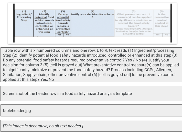
There are four options to choose from: an extremely detailed description of a table header’s individual columns, a basic description that describes the table header as being part of a safety template, the filename and decorative only, no alt text needed. Without knowing the context, many would select the first or second description as the most appropriate. Since the image is actually a topic header in Moodle from Associate Professor Clint Stevenson’s food safety course, it is easier to decide that the first option is far too detailed. Either the second or last option would be more suitable.
Tip: Always check the alt text when reusing an image previously uploaded in Moodle or WordPress because the original alt text is automatically added and may not be relevant in the new context.
Alternative Solutions: Ways to Make Images More Accessible
Based on the spring 2022 Disability Resource Office’s self-reported list, NC State has six legally blind students and 16 low vision students. There are others on this list who may also benefit from accessible images. You can have a significant impact on engaging these students by considering other factors that are important when students magnify images and illustrations.
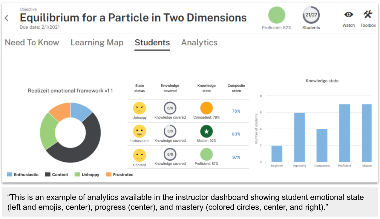
Caption: If you can create a great caption, it can help everyone. The caption below was created by Associate Professor Katherine Saul, Ph.D., for a recent DELTA News article.
“I really like this caption example because there’s so much going on in that dashboard layout – it is confusing. Looking at it was too much for me to process because I was not sure where to focus. The well-written caption puts it perfectly into perspective,” says Champ.
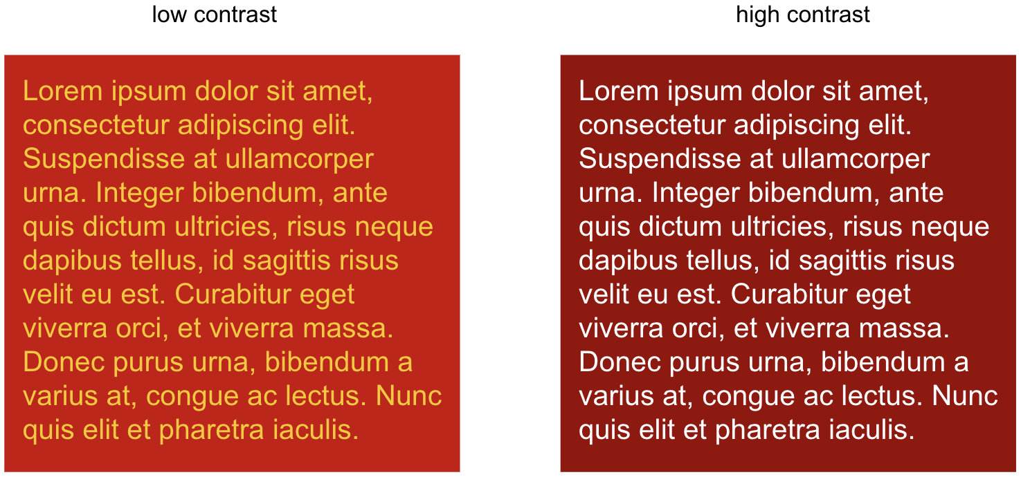
Contrast: The relationship and contrast between text color and background color can dramatically affect the ability of someone with low vision or color blindness to read the narrative. The higher the contrast, the more readable it is. The basic version of contrast accessibility minimum is 4.5:1 for standard text.
File Format: The type of file you are using affects how well the image will scale when enlarged. The example below shows a JPG file which was a photo from a textbook compared with a Scalable Vector Graphics (SVG) file. SVG files are designed to scale to any size without losing clarity, which serves students well in understanding the content. For help in learning how to convert image files into SVG files, contact LearnTech.

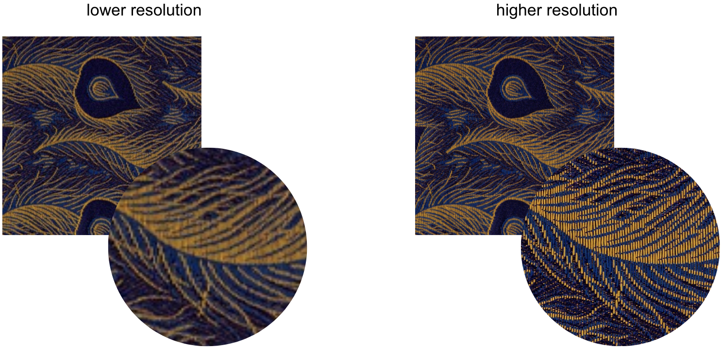
Resolution: When uploading images, we often choose lower resolution images to save space and reduce page load times. However, higher resolution images provide much more detail when enlarged. Once again, you must consider the intent, context and purpose of the image. Sometimes speed and smaller files are the best choice. However, sometimes a higher quality resolution is needed to maintain the level of detail required for a student to achieve the learning objectives. Notice how a higher resolution image of a textile (in the image below) allows for identifying individual thread patterns.
For more information about alt text or any other related concern, please contact LearnTech.


