Course Design with Accessibility in Mind

Making course content accessible to everyone not only levels the playing field, but creates a platform for individual talents to shine through. Lead Instructional Designer Caitlin McKeown understands this better than most and shared her passion for creating all course content with accessibility awareness at the forefront of the process at the Join the Journey: 2022 Digital Accessibility Conference.

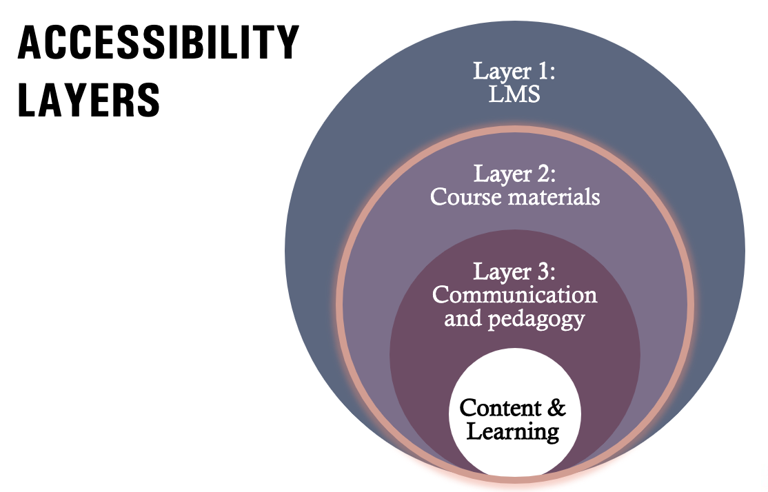
McKeown delivered a presentation called “Accessible Course Design” as a part of The North Carolina Higher Ed Digital Accessibility Collaborative sponsored by UNC Cause. She focused on identifying the most common accessibility issues discovered in courses, providing guidance for avoiding and addressing these issues, and explaining best practices in course design to support accessibility.
Documents can provide significant challenges — especially those not created by the instructor. They are often in PDF form which screen readers cannot read because they are processed as more of a picture than a document. McKeown recommends converting them to a readable format prior to uploading them. Other elements which may be included as part of a document can make content less accessible such as:
- Text Color: Avoid using a different font color for emphasis. Instead, use bold text and/or highlighted text to assist screen readers with emphasizing the text as important.
- Tables: If possible, bullet points work much better than tables for individuals who need assistance with accessibility. If you need to use a table, make sure the column headers have been formatted.
- Videos and Media: Captions or a transcript are needed to meet accessibility standards. Provide a video description if the video contains text.
- Images: Resolution is important and using higher resolution will help students who need to zoom in to acquire the detail needed to understand the image. Alt text descriptions are needed for all images that are not decorative.
- Image File Type: When possible, Scalable Vector Graphics (SVG) images are preferred over JPG or PNG images. They remain crisp and clear when enlarged.
McKeown also covered best practices for creating lectures, slides and e-learning presentations. When it comes to basic design, she recommends using a lot of white space, large text, and clear and consistent organization/hierarchy of the information. Pre-designed templates are great choices because they often are developed using brand colors or high-contrast palettes which help with accessibility. When possible, McKeown suggests using multiple formats. Also, screenshots of text should not be used because screen readers cannot relay the information contained on them.

Presentations
The keynote speaker was Attorney Logan Gerrity with the U.S. Department of Education, Office for Civil Right and National Digital Access Team (NDAT). He works with school districts, colleges, universities, public libraries and other institutions to assist with digital accessibility. Gerrity recognizes the challenges involved in making classes accessible — especially online courses. He offered practical recommendations for addressing the course design issues that present the most common difficulties when it comes to digital accessibility problems. Gerrity provides specific guidance upon request.
Senior Web Accessibility Analyst Kara Gaulrapp from the University of Pennsylvania covered accessibility concerns related to social media. She explained the benefits and shortcomings of different social media platforms such as Twitter, Instagram and Facebook. Gaulrapp recommends using plain text, creating text that speaks to your audience and creating appropriate and effective captions.
Front-End Developer Gia Branciforte from UNC Chapel Hill explained the attributes of Accessible Rich Internet Applications (ARIA) and described how to use it appropriately. She suggested using native HTML and not changing the native semantics unless absolutely necessary. Also, if it becomes very difficult to make a certain component accessible, she recommends rethinking and simplifying the design and set-up.
Senior UX Accessibility Specialist for Edward Jones and former IT Accessibility Coordinator for NC State Crystal L. Tenan shared a presentation called “Basics of Digital Accessibility Testing.” She talked about Web Content Accessibility Guidelines (WCAG 2.1) and noted that the WCAG quick reference guide is a simplified way to view the guidelines.
Digital Accessibility Office Team Lead Brad Held at UNC Chapel Hill discussed best practices for accessibility as it pertains to science, technology, engineering and mathematical digital content. He highlighted Universal Design because it offers multiple means of representation for students to acquire information and knowledge, multiple means of action and expression to provide alternatives for learners to demonstrate what they know and multiple means of engagement to tap into learners’ interest while offering appropriate challenges and increasing motivation.
Resources
Need help with making your course content accessible? Reach out to the DELTA Accessibility Team or take a look at the DELTA News article “Alternatives to Alt Text” published in February 2022.
Additionally, most of the slide presentations from Join the Journey: 2022 Digital Accessibility Conference can be found under the “Conference Schedule” link below each respective presenters name.


