Spring Clean Your Course

There are numerous ways to reduce visual clutter and streamline your online course. These high-impact, minimal-effort options can provide organization and give your course a sleek appearance based on instructional design best practices.
Decorate and Organize with Moodle Banners
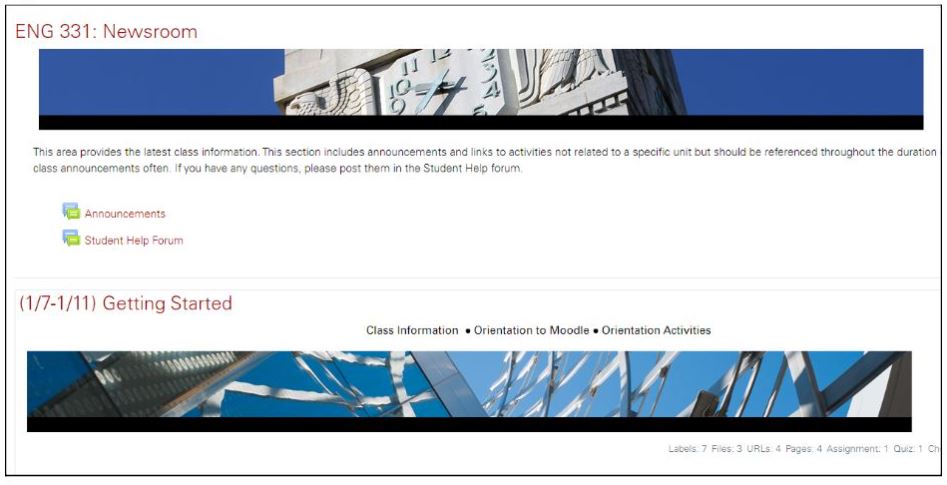
Banners are horizontal images that can be included in a Moodle course. They provide a simple way to add visual appeal to your course. They also help organize the overall course by segmenting modules.

You may use your own images or those preformatted by DELTA staff. If using your own images, make sure they are 1200 x 110 pixels.
Clarify with a “Start Here” Module
This module is essential for giving students a strong start in your course. It may include class information, Moodle orientations, an introductory forum, and other orientation activities.

For more about this important module, see Helping Students Get Started in an Online Class.
Declutter the Top Section
Each Moodle course includes a “Top Section” that is visible at the top of the page, no matter which module students are viewing. If you currently have numerous items here, consider moving them to the “Start Here” module or another section where they would be more relevant.

Illuminate with Video Length
By including the length of each video, students will know what to expect before pressing play.

Simplify with Weekly Announcements
Rather than cluttering students’ inboxes (and your to-do list) with multiple reminders and updates, send one announcement per week that includes reflections about previous topics, praise for one or two student submissions that model excellent work and an overview of what to expect for the upcoming week.

For more, see Perk Up Your Course Announcements: 5 Tips for Enhancing the Faculty-Student Connection
These are five quick methods for cleaning your course…next month we’ll have an article about deep cleaning. Stay tuned!


