Making Metabolism Easier to Digest
Learning about digestive processes just got flashy for the students in Nutrition of Domestic Animals (ANS 230). As a DELTA multimedia project, four Flash animations were created to deliver content that has proven difficult for students to grasp in the past, said Amanda Robertson, multimedia design lead. According to Robertson, these animations address concerns instructors had about bringing the course online.
The project team was comprised of two faculty members, Dr. Joan Eisemann and Dr. Sung Woo Kim; the project manager and instructional designer: Cathi Phillips; multimedia design lead: Amanda Robertson; and three students working as design interns: Jordan Deva, Ayanna Seals, and Meredith Laxton.
Phillips and Robertson initially met with the two faculty members in December last year to review the prospects of an animation. The concepts that these animations illustrate and explain were particularly difficult for all students. Therefore, the animations will be used in both online and face-to-face versions of the course.
Because he already had experience with creating animations for courses, Deva, a senior in Art and Design, acted as a lead on the student design team. Student interns attended meetings with faculty and weighed in on discussions. “My role was to help the project move along and give the other members someone to check in with,” Deva said. The team looked through the instructor’s PowerPoint presentations, discussed and collaborated with the content experts, and researched the material to get a better understanding of the content and form an approach.
To address these difficult concepts, the team originally planned to create three narrated animations. Later on, the concepts were broken up into the following four topics: lipid digestion, lipid metabolism, protein digestion, and protein metabolism. The animation process for these started in late March and finished in early October.

When adapting complex content to an animation, the first step is taking time to sit down and learn the concepts. “We had to go very slowly and meet with the instructors about each different scenario,” Robertson said.
The team decided to start work with the protein digestion animation even though the section on lipids comes first in the course’s structure. Because protein is a simpler concept, the team could wrap their head around the material and establish a workflow with the faculty members, Robertson said. According to Robertson, it’s very important to build a good relationship with the faculty members. Starting with a less challenging part was a good way to ease into the project.
Animation process
To make the transition from concept to reality, the process is broken up into several distinct steps:
Storyboarding
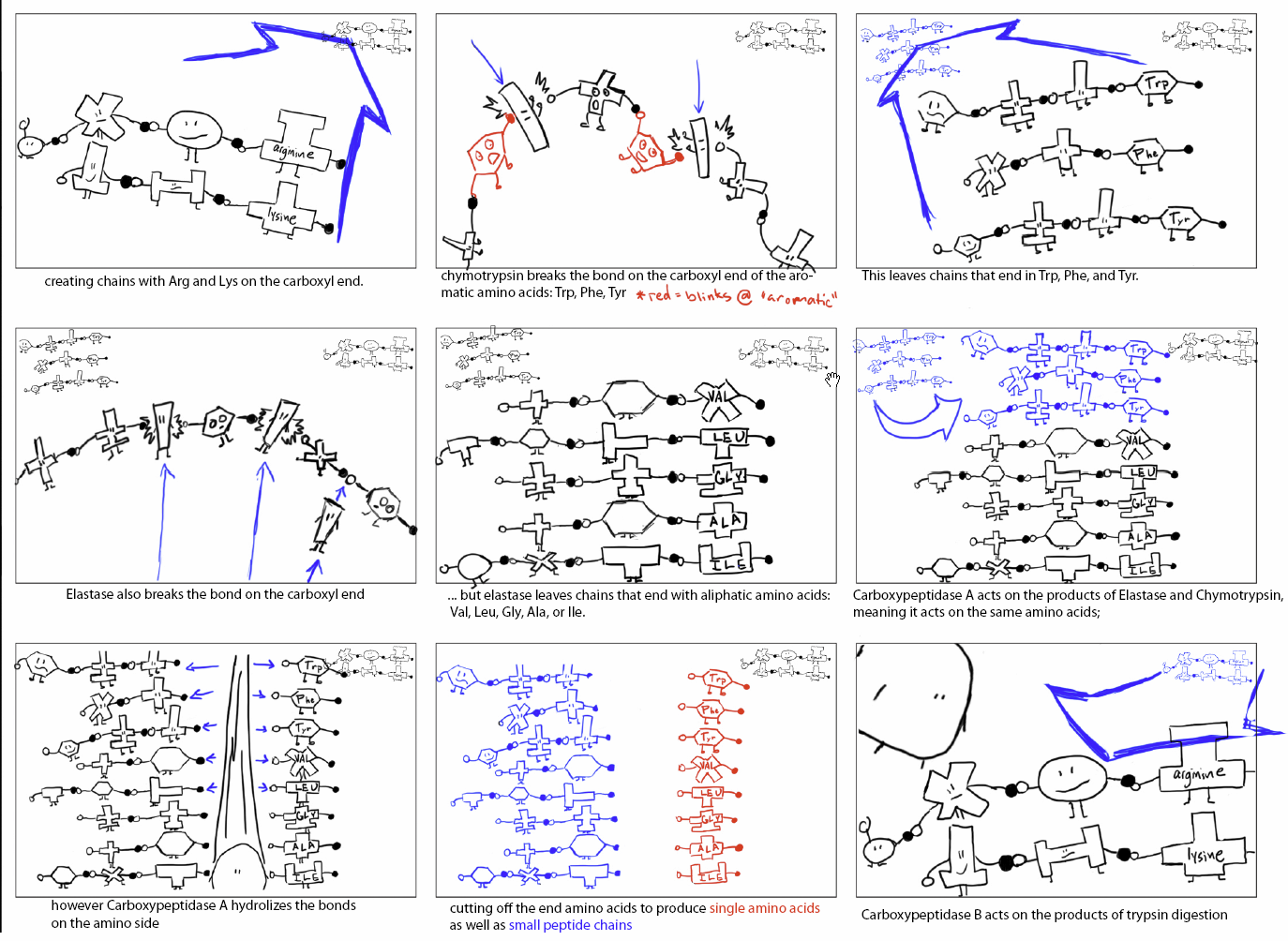
Once the student workers had a good enough grasp of the content, they started work with character designs and storyboards. Storyboarding is one of the earliest and most critical steps in the animation process. A storyboard is a sequence of illustrations with accompanying text, like a large comic strip, used to organize and plan out what will happen in the animation. For animations like these, storyboards are a critical step toward transferring the content into a visual representation.
After the first version of a storyboard was complete, both Phillips and Robertson looked it over and suggested changes for improvement. The student workers then made a second version of the storyboard based on these suggestions. Sometimes a storyboard went through several revisions before being approved by Robertson, Phillips, Eisemann and Kim.

According to Robertson, animation would take an eternity without storyboards. “Storyboards are very important as a basis for animation because they can give a very good idea of what the end product will look like,” she said.
Character designs
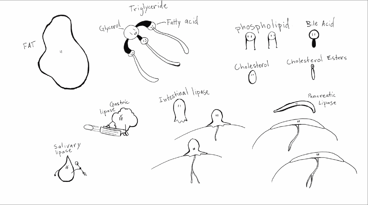
In animation, character designs take the form of prepared model sheets. These act as a point of reference during animation so characters maintain a consistent appearance. But when working with biology illustrations, you can’t just throw together any batch of characters – they have to mean something.
A lot of care went into designing the characters that represent the organisms depicted in these animations. In design and science there are many stereotypes, icons, and symbols that all hold certain meanings. Realizing this, student workers researched various characters and past representations so they could make deliberate choices when designing the characters.

They looked for common representations in biology that had been agreed upon to represent certain things. When making a biological representation like this it’s essential to create representations distinct from, or in keeping with, any pre-established depictions to be accurate and avoid any confusion.
Robertson said faces were added to the characters to engage students by adding a cartoon element. “The big goal is to engage the students,” she said. “As a lot of instructional designers will tell you, if your students get bored, you’ve already lost the battle.”
They didn’t want to overstimulate the viewer though. When creating the characters they chose to go with a monochromatic scheme to avoid distracting from the content and message. “When you choose to use color there needs to be a considerable amount of thought put into it,” Robertson said. “There’s a lot of meaning behind color.”
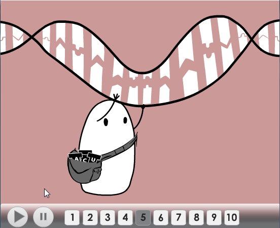
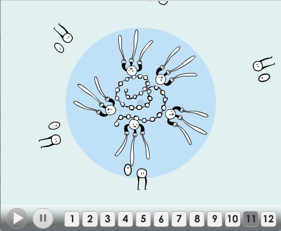
Using simple, black and white characters avoids visually overwhelming viewers so they can focus on listening to what is going on, said Robertson. However, color was used for the backgrounds: videos in the stomach and intestines have a pinkish background and lipid videos have a light bluish background so that students can differentiate between them.
Animatic and Narration
An animatic is a roughly animated version of the final product. These further establish a timeline and progression. In this stage, designers rough in some characters as placeholders but the overall framing of scenes is established.
According to Robertson, there were a ton of animatic versions going on at once. Because these animations had to tell a story, timing was critical. Some animations required several dozen iterations of animatics before the animation was completed.
After establishing the animation’s timing and finalizing the script, narration was recorded and synchronized. According to Robertson, closed-captioning for the videos are in the works for upcoming months.
Interface
The animations are created in a Flash file that is in a vector format, meaning that it can be scaled without a loss in quality. The team determined that Flash was the best option because it is easily embedded and played in almost any web browser.
The video navigation is broken into numbered segments, which allowed development to highlight the individual steps. This segmented approach was first used for animations developed last year for Introduction to Psychological Research (PSY 230). Using this approach, students can return to parts they need to revisit without fiddling with a slider.

Project Results
Both Ayanna Seals, then a freshman in Art and Design, and Jordan Deva worked together to create characters, storyboards, and animations for protein digestion and lipid digestion. Familiarity with the software and steps of animation varied between team members. “For Ayanna, it was more of a learning experience,” Deva said. Fortunately, the rest of the team was fairly proficient with Flash, so they were able to give pointers when necessary.
Meredith Laxton was brought onto the team in June to help with the workload. Because she joined after the storyboard for lipid metabolism was completed, she started by adapting it to an animation. “By the time that I first got in, Ayanna had just finished the storyboard for one of them and I kind of looked at hers as an example for how I should model mine,” Laxton said.
Although she said she did have to check in with Deva to get clarification on the material, she was able to get up to speed and complete the entire animation process, from storyboarding to finished product, for protein metabolism on her own.
Robertson said she hoped the student workers would be able to take away, and potentially put in a portfolio, the ability to collaborate with a group and produce unified content.
Deva said that because the characters were pretty simple there wasn’t a whole lot of room for stylization. However, when Laxton storyboarded lipid metabolism the team ended up preferring the way it looked. The team decided to go back and revise the lipid digestion animation. “We adjusted the characters to match Meredith’s style,” Deva said.
Though they cited some difficulty with working on different computers and with different versions of software, the student workers said that working together wasn’t hard. “It helps when you’re about five feet away from everybody,” Deva said. Although the three members of student design team naturally have different styles, the animations that resulted are four stylistically similar, informative Flash videos that explain biological processes in a memorable way.
See the Animations for Yourself:
- Categories:


